Maribou State
Kingdoms in Colour
CREDITS
Project: Kingdoms in Colour by Maribou State
Art Direction : Alexander Brown
Flower Illustrations : Pierre Joseph Redout
Label: Ninjatune
Maribou state was an interesting project for me, Ninjatune approached me to pitch on the artwork for the band. They had a brief which I immediately felt I could do something for – their main brief – make sure it’s colourful. Their album had been developed by the band for quite some time. They toured the world since their last album. In that time they recorded songs, weaving their sonic landscape from the countries they travelled through. They wanted an album cover that is about everywhere, and had that spirit of travel and adventure.
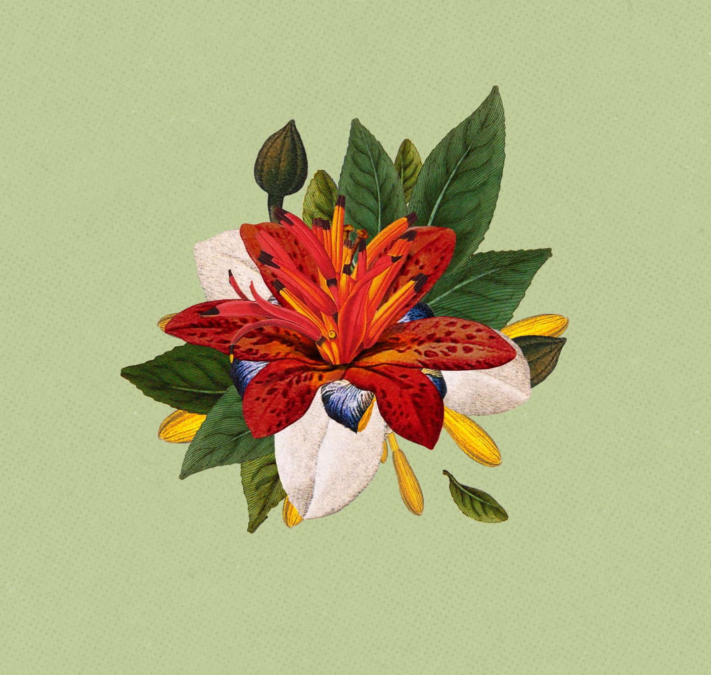
I was travelling through Mexico at the time, and was then posted on a job in Australia, so in some ways I was following their steps. The problem is, getting everywhere into one image is challenging, unless you pull out and see the whole world, or do a collage of everywhere in the world. I wanted to paint a picture of distant lands, of these kingdoms of colour written into the notes of this album, so I started doing artwork about exactly that. However, I realized I could never do these imaginary places justice, anything you could draw or collage – it would somehow just kill the whole thing for me. Better to keep it a mystery – to leave the exploring to listening to the record. Then I was suddenly reminded of the charlatan victorian travellers bringing back bizarre and wonderful creatures which they had made from bodyparts – and suddenly the idea slipped into place – what if the artwork, was a flower from everywhere. A sort of calling card perhaps. A momento of a place so wonderful, the only way you could help someone imagine it, would be to bring back a small piece of it.
A sort of beautiful, mutant Frankenstein flower, with petals from all over the world.
I pitched it to the label, along with some other ideas – but that was the only idea they wanted to pitch. Initially because I assumed my other ideas sucked. However the reason, it turns out, was because of their conviction in the concept. Well, the band hated it. I mean, they didn’t love it. I was sent away to come up with more ideas. In the end I worked on about 40 different executions. The band didn’t seem to get behind any of my new ideas, you know, they liked them enough to keep working with me, but not enough to commit. So I kept on coming up with other concepts.
The label are becoming concerned, I’m late to deliver, At this stage I’m doing what I wanted to avoid, working on this collage of places all over the world. I had included photos from the band’s trips and created a very scrap-book kind of thing, it was nice, but my heart was aching for something as elegant as the flower idea. I’ve already planned to pitch it for something else, it’s just gotta be a cover!
It’s now the day before we deliver, this huge collage is taking hours to get right. The band just can’t settle on anything I present, its all becoming a bit depressing. Suddenly, I have this idea, just for the sake of my own sanity, I go back to the flower collage and look at it, and think to myself – how can I get this over the line? So I find a hand and put that in. That’s all I added. I slipped it in at the back of a deck, after my other options, as a “look I know you guys already said no to this but……” kind of statement. I was a bit nervous that they would get annoyed that I was wasting time or lose faith in me. So when I got to that page I held my breath – we were on Skype. Suddenly the band loved it, their whole idea around it changed. The hand gave it a cheeky wink, it stopped it looking so dry, and ultimately, they went for it – then and there. I had a very nice chat with their buoyant manager the next day. It was one of the nicest turnarounds I’d ever had.


